School Nurse Interview Questions
February 1, 2016Top 10 Universities for Nursing in the World 2016
March 30, 2016How does health care in the United States compare to health care in the rest of the world? In 2013, MPH@GW, the online Master of Public Health program offered through the Milken Institute School of Public Health at the George Washington University, created an infographic that measured the U.S. against 16 other countries using various health indicators. For 2016, MHA@GW, the school’s online Master of Health Administration program, developed an updated version of the graphic using the most current World Health Organization (WHO) World Health Statistics Report. Though the U.S. continues to hold the top spot in the health expenditure category, it lags behind in other areas such as immunization coverage, density of health workforce, and life expectancy. The updated infographic pulls data from 2012 and 2013. The 2013 version pulled data from 2011.
Differences from 2013 to 2016:
- Population Total: Although the U.S. population has increased by just over two percent — from 313,085,000 to 320,051,000 — it still has the third highest population among the nations cited, behind China and India.
- Gross National Income Per Capita: Singapore still leads the world in this category, and the U.S. remains second. However, the numbers for both countries have risen — and Singapore’s increase is significantly higher in comparison. The U.S. is up to $53,960 from $48,820, and Singapore has moved to $76,850 from $59,380.
- Per Capita Total Expenditure on Health: The U.S. continues to remain at the top of this category, with total expenditure on health increasing more than 7 percent, from $8,233 per person in 2013 to $8,845 in 2015.
- Life Expectancy at Birth: This category has remained stable for the top five countries, with Japan again leading with a life expectancy of 84 years, up from 83 years in 2013. Singapore, Australia, France, and Canada round out the top five for 2015, as they did in 2013 — and the U.S. remains ranked eighth with a life expectancy of 79 years for Americans.
- Immunization Coverage for 1-year-olds (Measles): The U.S. remains 12th among the nations at 91 percent, up slightly from 90 percent in 2013. The leading five nations remained the same, except for the U.K. and Mexico, which reversed in this category over the past two years. In 2013, Mexico was ranked fifth at 98 percent, but in 2015 dropped to the 13th spot at 89 percent. The U.K. now stands at 95 percent, up from 13th in 2013 at 90 percent.
- Population Using Improved Drinking Water Sources: This category was stable with the top seven countries again at 100 percent, and the U.S. remaining ranked eighth at 99 percent.
Category Updates
Categories that appeared in the 2013 infographic that have been omitted in the current update due to lack of adequate data for most countries listed include “Contraceptive Prevalence” and “Hospital Beds per 100,000 Population.” A new category that measures the density of health workforce has been added. View the updated US Healthcare vs the World infographic below.
[responsive]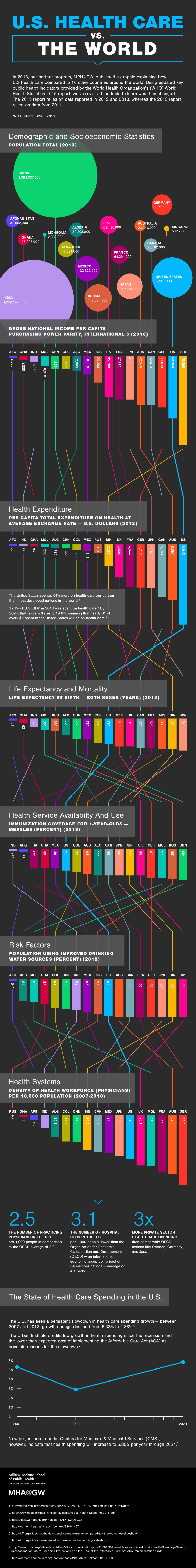
source: https://mha.gwu.edu/blog/us-health-care-vs-the-world-2016/